

Starting my research
Starting my UX boot camp I was told to pick a business to help them redesign their website. I picked a place that for the longest time I wanted to spend time at. Thinking it be a great opportunity to go and hang out and do my research.
After doing my very first interview, it was clear as blue sky in the middle of June that I will not be doing my research about this place. My research took a welcomed turn towards EVENT ATTENDING. So I went with it…
Having worked in events planning gave me a head start with writing my survey & interview questions. I got myself back into an events planner headspace that wants to through the best events in the country.
After conducting interviews & sending out surveys I was able to gather a lot of great information. Let's go over a few of the steps I took.
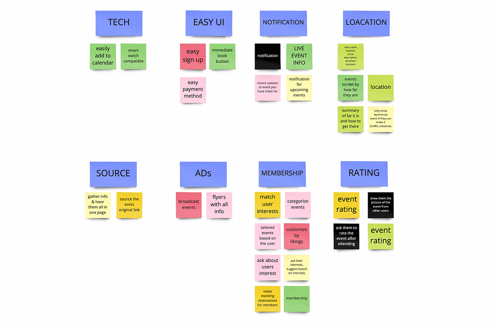
With the data, I gathered from my interviews and surveys I was able to put this affinity map together that opened so many doors for me to dive deeper into my research. Now I could see an obvious pattern…
KEYWORDS
Anticipation
Wrong information
Last minute
Sold-out


Journey Map

PROBLEM STATEMENT.
Natalia wants to get accurate and fast information about events happening around her city. She does not have the time to do research and spend time on different platforms looking for events.
HOW MIGHT WE...
How might we give Natalia the correct event information?
How might we help Natalia to find the right event?
How might we make it easy to book a last-minute event?

Create a personal feed
Live updates of booked events
Easy payment
Membership
User flow

On boarding flow
Buying tickets flow

Move us around
 |  |  |
|---|---|---|
 |  |  |
 |  |

Usability Testing
Doing my lo-fi usability testing, brought out the minor issues that one would have faced such as:
lake of the back button & skip button
no ability to add to Apple Wallet and select neighborhoods instead of mils.
Mid-Fi
By moving to mid-fi I had a more clear path to
make changes and bring the features that I got from my ideation to life
By creating my wireframe in Figma I was able to do a mid-fi usability testing that gave direction to where the user needs to be and how they want to get back if they should make a mistake. I added the back button and the user's profile picture instead of the hamburger menu.


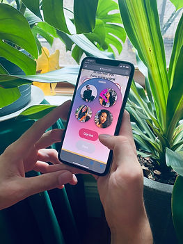
Hi-Fi
It was not done yet
After finishing my Hi-fi and presenting it, I realized I am not happy with how it turned out. I will be showing you what I had, just because you took the time to read this page. but make sure to remember. I didn't know any better and I was short of time.
old
new
Hi-Fi Usability Testing


Style Guide

what's next?
My plans for this project would be to further improve my UI and hold more ideation sessions to tackle futures that would better users expressive